 |  |
|---|---|
 |  |
 |  |
 |  |
 |
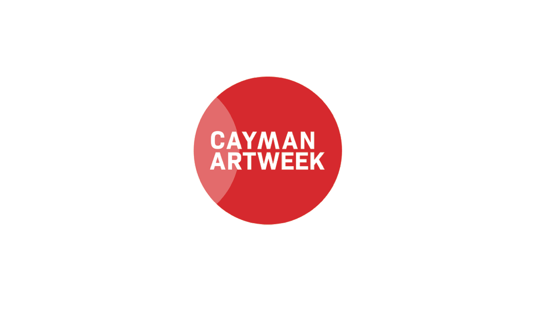
CAYMAN ART WEEK
CLIENT: Cayman Art Week
AGENCY: Sprocket Rocket Ltd
PROJECT: Brand identity
BACKGROUND
Cayman Art Week (CAW) is an annual week-long curated programme of gallery tours and open studios around the Cayman Islands. Designed to celebrate and encourage the collection of Caymanian art, CAW offers unparalleled access to over 30 art venues and provides a singular platform through which to showcase a range of discussions, pop-ups and exhibitions to local and international audiences. CAW is dedicated to ensuring Cayman’s cultural landscape continues to thrive by connecting collectors with creators to facilitate the sale of art.
OBJECTIVE
To create an identity which reflects the ambition and wide scope of the project. To highlight CAW's main focus, which is to enable conversations between artists, galleries, collectors, curators, art experts etc.
CONCEPT
The iconic red dot is the mark of a sale.
But this is not just a red dot...
When overlapped it represents a connection
It represents collaborations
It represents communities
It represents events and workshops
It represents places on a map
When all these activities come together the overlapping circles become a single red dot, the internationally recognised symbol for the sale of a work of art.